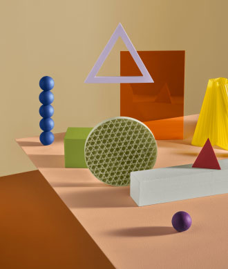
Feast your eyes on Plascon’s 2025 Bright colour family
Plascon has unveiled a dynamic colour family, titled Bright, that forms part of its hybridity-themed 2025 colour forecast.
09/01/2024
Online ecosystems are in a constant state
of evolution. Algorithms shift, social media
platforms rise and fade, and artificial
intelligence reveals new ways to engage in
cyberspace. As digital culture progresses, the
lines between virtual and physical environments
blur, creating a reality that is uniquely its
own. In response, Plascon has unveiled a dynamic
colour family, titled Bright, that forms part of
its hybridity-themed 2025 colour forecast.
The Bright colour family stands out by
exploring the intersection of similar
contrasting realities, showcasing a dazzling mix
of soft neons and vivid fluorescents that
reflect today’s zeitgeist. The colours draw
inspiration from the Dopamine Decor trend, a
playful and personalised approach to interior
styling that boosts mood. Psychological research
shows that light and bright tones can evoke
positive chemical responses in our brains,
enhancing the production of dopamine: a
neurotransmitter crucial for reward, motivation,
and regulating mood and movement.
Yellow,
often linked to happiness, is exemplified by
Crazy Daisy (Y4-A1-1). This colour, reminiscent
of emojis or egg yolks, brings a lighthearted
touch, much like the electric orange of Good Day
Sunshine (O6-A1-1) and the zesty green of
Stylish Lime (Y7-A1-1). Leveraging the power of
contrasts, this colour family includes five
pared-back tones that carry the same extroverted
essence. The pastel peach of Morning Crescent
(O6-A2-1) and the light lemon of Namaqua Daisy
(Y4-A2-1) offer soft yet striking variations of
their more saturated counterparts.
‘The
need for uplifting interiors is just as relevant
in South Africa as it is worldwide. Bright
colours that celebrate our nation’s rich
cultural tapestry foster a strong sense of
belonging and identity, while also instilling a
sense of hope in a challenging socioeconomic
environment,’ says Plascon Brand Manager Kristel
Dreyer.
‘In times of difficulty, these bold
colours can serve as a reminder of resilience
and vitality, encouraging communities to embrace
positivity and envision a brighter future.
Locals are increasingly incorporating bold hues
into their homes and commercial spaces, and
we’re excited to see how this trend continues to
evolve in the coming year.’
Plascon’s
Bright colour family celebrates unexpected
pairings and captivating tones that are both
versatile and eye-catching, poised to make a
statement as accents or infuse a space with
bright intensity. Lapis Blue (B6-B1-1) offers a
cool, chalky alternative to cobalt and serves as
a grounding element, alongside the rich,
dazzling Passion Red (101) and the strong
eggplant hue of Plum Sensation (P4-B1-1).
Together, these colours are designed to replace
traditional black or navy, and introduce a
contemporary twist to the basics.
In
contrast, the soft lavender of Rain Lily
(P1-B2-2), the subtle yellow of Frozen Limeade
(Y7-A2-3) and the gentle Green Glass (81)
provide fresh and invigorating alternatives to
traditional neutrals. These modern
interpretations of pastel colours should not be
underestimated; they possess the ability to
completely transform the atmosphere of any room
or outdoor space where you might not expect to
see them.
The Bright colour family invites you to embrace the brilliant interplay of colour in your space. Whether you’re drawn to the magnetic exuberance of the intense brights or the soft elegance of their counterparts, Plascon’s vision inspires you to reimagine your surroundings and transform them into unique expressions of joy and creativity.
For free advice on how to use the Plascon 2025 Colour Forecast or any other Plascon colours, contact the Plascon Colour Advice team via email: ColourAdvice@kansaiplascon.co.za. Visit www.plasconcolour.co.za for more information.

