One headboard get three different looks
Interior designer, Liz Woods, designs three different looks for a headboard.
sunset publishing
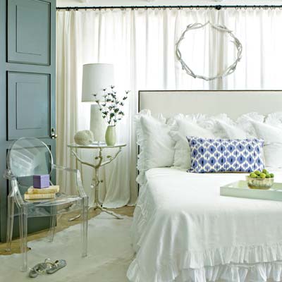
Blanketed in White
For the first look, Woods wanted something soft and feminine, so she chose a light palette and incorporated ruffles in the bedding. "When working with white, I tend to layer different shades," she says. "This gives the room dimension and helps keep it interesting." The lavender pillow's rectangular shape and colourful pattern contrast with the white palette. "I always like when beds have punctuation - this pillow is the exclamation point on the bed." says the designer.
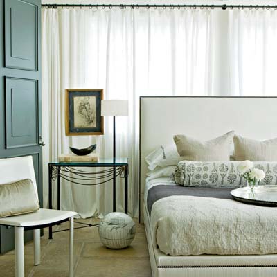
Shades of Grey
"This bed is all about texture," says Woods. "The charcoal blanket has a luscious loose weave that you want to just fall into. The muted colours lend a bit of masculinity, but the interplay of textures softens the look. I added the bolster pillow to pick up the charcoal colour of the blanket and the leaf detailing on the pillowcases. It marries the different shades of grey, and the organic pattern is not too feminine. The elongated shape echoes the shape of the bed nicely."
Notice that this is the only look without a bed skirt, with all of the blankets, sheets, and coverlets tucked in. "Tucking in the linens creates a cleaner, finished look and is another way to emphasize the headboard," explains the designer. "It also shows off the nailhead trim on the headboard."
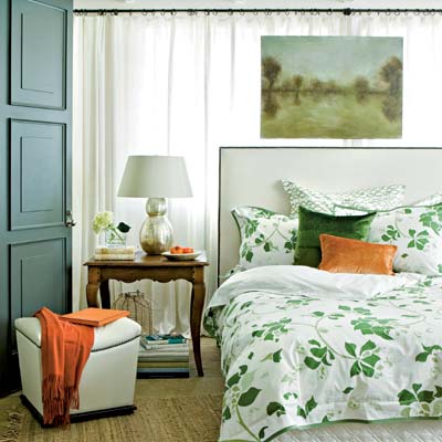
An Appealing Pattern
"I was drawn to this pattern because it is not overwhelming. It also has unisex appeal - green is a great colour for a bedroom," Woods says. "This look is more relaxed and natural, so I paired the duvet with a quilted, structured skirt for contrast. The velvet accent pillows provide richness and a sense of depth. I love the persimmon with the green."


