Make 2014 a colourful year
Bring your life - and your home - out of the doldrums with a splash of colour. Whether you use paint or accessories, colour invigorates and refreshes a home and instantly gives you a boost.

79ideas.org
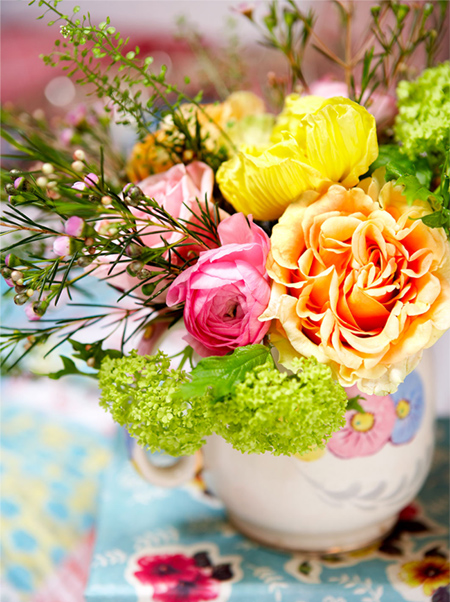
Take your colour cues from Mother Nature. Summer blossoms provide plenty of inspiration for colour combinations for a home. Take your colour choices and view them on the Plascon Inspired Colour system to view complementary, adjacent and monochromatic colour selections. Summer gardens explode with colour bursts in all the shades imaginable. If you don't have flowering plants in your garden, visit your local garden centre or florist for inspiration, or take an online colour tour.

joannahenderson.com
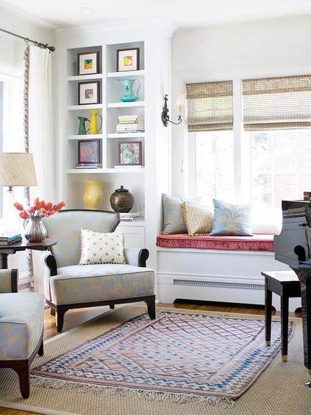
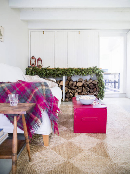
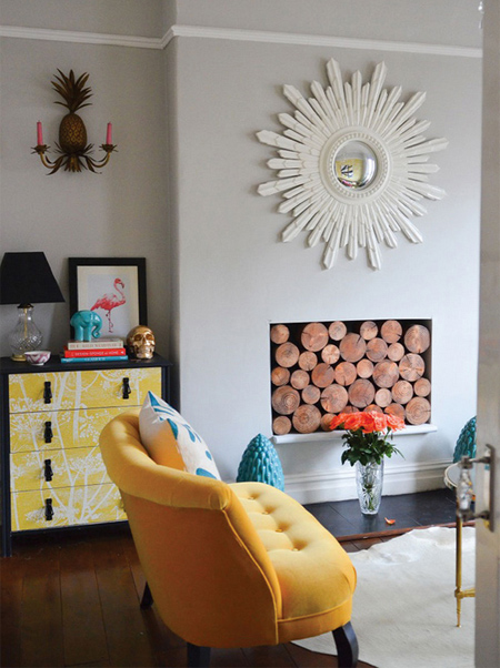
If you have always been afraid to bring colour into your home... take baby steps! Start introducing colour using decor accessories; rugs, cushions, throws and other items that you will find a home decor stores at affordable prices. In this way you will slowly build up colour confidence.
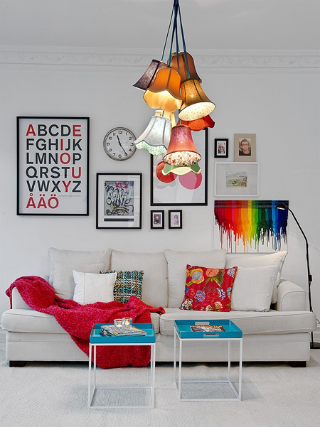
alvhemmakleri.se
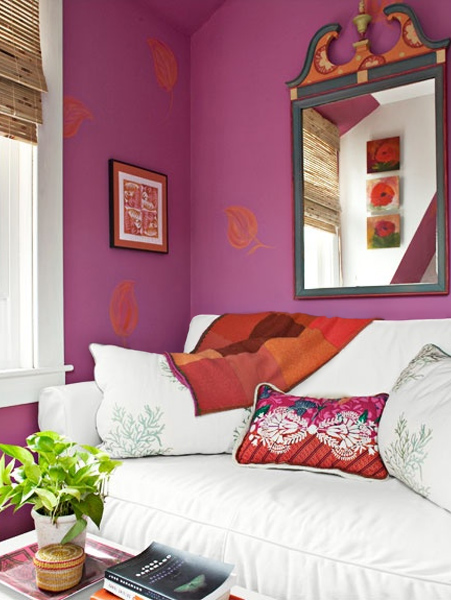
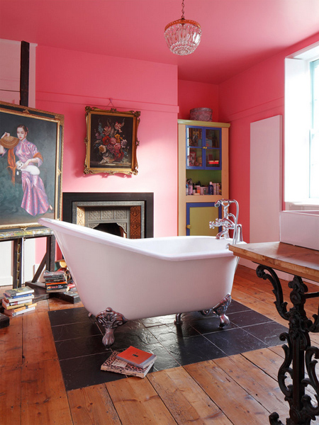
Radiant orchid is Pantone's colour of the year for 2014 and you can expect to see this colour popping up everywhere. This versatile shade can be combined with other colours for an instant punch of colour in a home.
Visit your local Plascon Paint centre or Builders Warehouse paint section and have Plascon Cloud Terrace [P6-B1-1] mixed in one of Plascon's quality interior wall paints.

jhinteriordesign.com
hearthomemag.co.uk

joannahenderson.com
The colours you see on a screen, or in a magazine, are not always the same as those on a colour swatch. When buying paint colours it's always wise to find a colour match using Plascon paint swatch cards. Take these home and place them in the room being painted and take the time to view the swatches under different light conditions.
jhinteriordesign.com
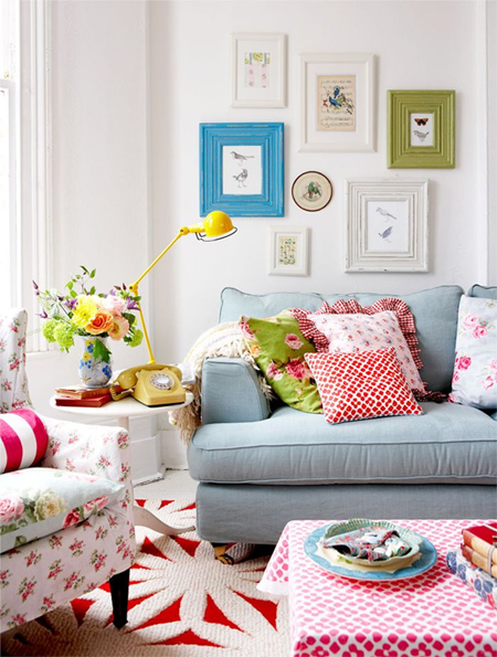
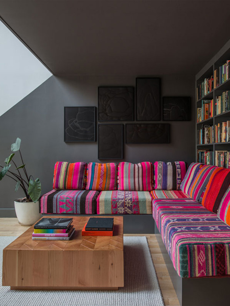
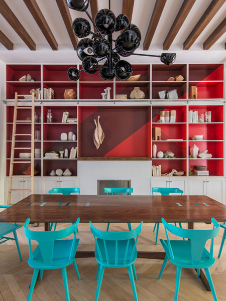
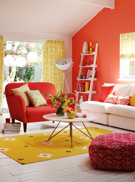
Colour lovers can express creativity with bold, bright contrasting colours. Choosing complementary colours - colours from the opposite side of the colour wheel - add the most impact.
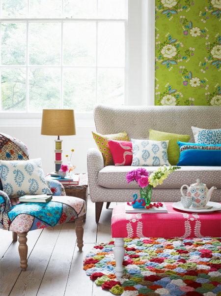
Use the 60-30-10 Principle to avoid overloading with colour. Apply your main colour to approximately 60% of the room, and introduce a secondary colour to about 30% of the remaining surfaces to add contrast and interest (think feature walls and furnishings). An accent colour should make up the final 10% – introduce this in cushions, rugs, and accessories, for example.

brandsexclusive.com.au
joannahenderson.com
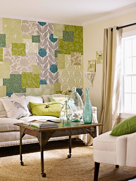

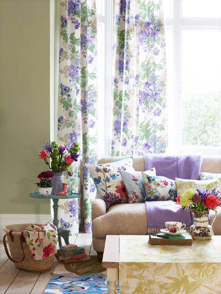
Colour doesn't have to be bold and in your face. Subtle hues can be combined to create a colourful feature that is interesting without being overpowering.