Tips for arranging furniture
Where you place your furniture in a room sets the tone for how you’ll live in that room. Here are tips for arranging spaces for chatting, watching TV or relaxing.
Most homes are filled with furniture-arranging challenges. Follow these simple tips to turn your design dilemmas into successful arrangements.
1. Take Measurements
The first step in arranging a space is determining its size. Use a tape measure to get the dimensions of a room. Or, a quick tip: measure your foot and then walk heel to toe across the room. It's an easy way to estimate the basic size, and counting your footsteps will give you a rough measurement before you shop for furniture. Always check the dimensions of the hallways, stairs and door widths leading to the space. This is the eternal challenge for the homeowner, being sure the entrance and egress of the room is large enough for potential purchases.
2. Estimate Volume
Every object has a height, depth and width. For added visual interest to any space, add varying furniture of varying characteristics. If you are going for a serene, unchallenging area for rest or recover, keep the furnishing volumes in a room similar.
3. It's All a Matter of Scale
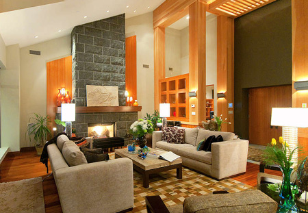
The size of pieces relative to one another and the size of the space is their scale. Again, similarly scaled pieces are more serene when used together, but a nice balance of pieces creates a harmonious atmosphere, utilizing the differing physical qualities of height, depth and width throughout the room. When furnishings are out of scale, you'll notice that it just won't feel comfortable or right.
4. Create a Healthy Relationship
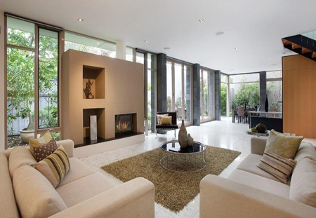
The relationship of items to one another to form a pleasing whole is termed balance. There are two forms of balance — symmetrical and asymmetrical. Bilateral symmetry is like the human body: there are two of everything. Asymmetry refers to an imbalance, such as two candles of slightly different sizes next to each other. Symmetry is very restful, while asymmetry is used to add visual motion and excitement.
5. Paint Your Room
Look at your space as a painter looks at a work of art. There are visual tricks that painters use to create the appearance of depth in a space. You can use these tools, too. The first trick painters use is
'triangulation'.
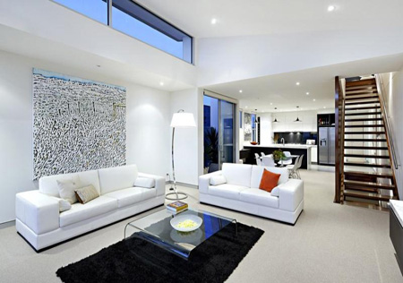
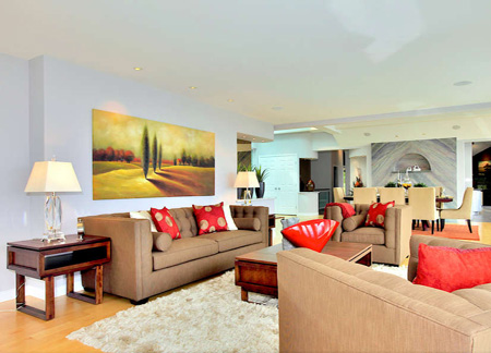
A basic example of triangulation used in interior design is the placement of two end tables on either side of a sofa with a painting over the sofa. If you can imagine this scene, it is lower on the corners with the apex of the view just above mid-centre at the top of the painting.
The second trick painters use is the creation of depth in artwork, which is a two-dimensional medium. Paintings often have a foreground, mid-ground, background and vanishing point. Stand at the threshold of your room. Place a chair, perhaps at an angle, in the foreground closest to you.
The cocktail table will provide a mid-ground and the sofa with the wall behind it, the background. A window in the scene will give you your vanishing point. Or, the vanishing point can be within a work of art placed above the sofa.
6. Think Gestalt
All furniture arrangements have a certain gestalt, or
'totality,' a
'form'. Large rectangular spaces can be dealt with by dividing the
'form' of the space into another form. A long narrow living space, for instance, can be split in two by creating zones of function.
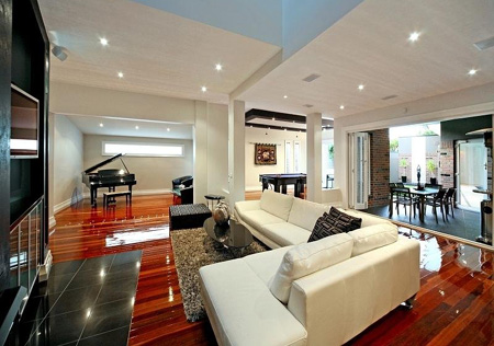
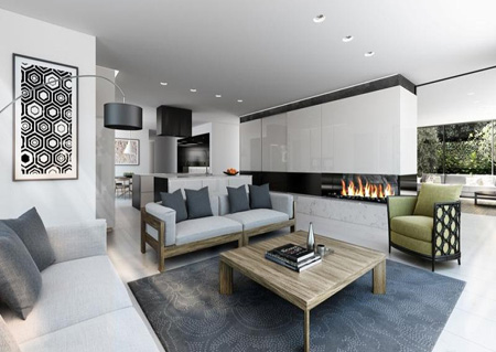
Say, one half is for the sofa, or the function of conversing, and the other half is for a dining set, or the function of dining. This helps you take the bite out of large rectangular rooms by dividing them into squares by zones of function. Humans tend to feel more comfortable and less formal in square furniture arrangements versus rectangular.
Mark McCauley is a professional member of the American Society of Interior Designers (ASID) and is author of Color Therapy at Home and Interior Design for Idiots.

