
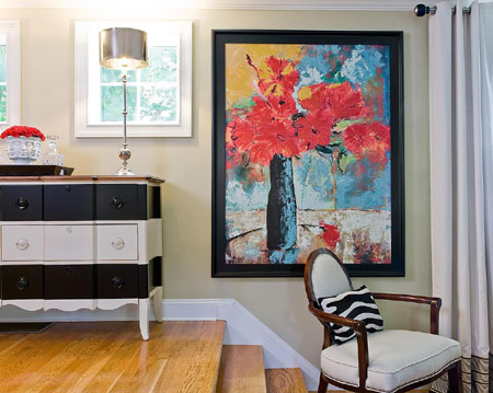
Picture perfect
How to choose mats and frames that bring out the best in your artwork.
When it comes to framing art, the point of framing is to make the art look as good as it can. Too much attention is sometimes paid to matching a frame to flooring or other elements in a room; it is better to take cues from the artwork instead - a frame should answer to the room but not take orders from it!
Colour
Warm palette or cool? You don't want the frame or mat to fight with the colours in the artwork-or overwhelm them.
Scale
A mat that's roughly twice the width of the frame often looks pleasingly proportional.
Line
Whether the style of the work is angular or softly impressionistic, a frame shouldn't contradict the lines of the art.
Style
Contemporary, traditional, or rococo - this is where room decor may be a factor, along with the period and style of the art.
The Process:
1. The frame gives your artwork presence, defining its space against the wall and drawing a viewer's eye into the image. Frames come in a huge assortment of colours, materials, and styles - some elaborately three-dimensional, others barely there. In general, wide or complicated frames work best with large works of art, simpler frames with smaller pieces.
2. The purpose of a mat is to provide visual breathing space between the frame and the artwork, and to physically hold the art away from the glass. Acid-free archival mats prolong the life of your piece. Choose a colour that is related to tones in the art but doesn't distract from them.
3. Any light is damaging to art over time, but what's the point of art kept in a drawer? Museum glass provides protection from ultraviolet rays. If reflections are an issue, use non-reflective glass has an anti-reflective coating.
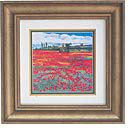
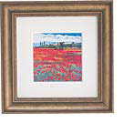
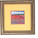
What's Wrong With This Picture?
The same print in the same frame (here, in different sizes) makes a different impression, depending on how it's matted.
Too-Narrow Mat
The double matting is a good idea, but the white mat is so narrow, the print looks choked by its tight collar.
Seeing Stripes
A mat cut to the same width as the frame creates a static, striped effect. With no dark undermat to define the edges of the art, its light areas wash out into the white mat.
Too Much Colour
The red undermat and emphatic yellow in the larger mat distract from the image. It's
[via joanne trestrail]