
50 Shades of grey
With the movie 50 Shades of Grey due to hit the circuit this weekend to tie in with Valentine's Day it seemed appropriate to look at how shades of grey don't have to be bland but can inject just as much personality as other neutral shades.
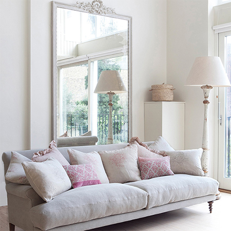

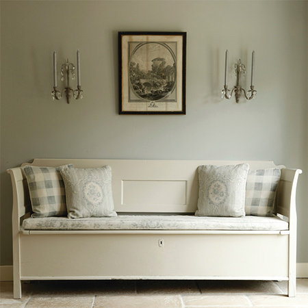
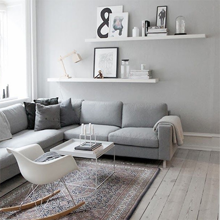
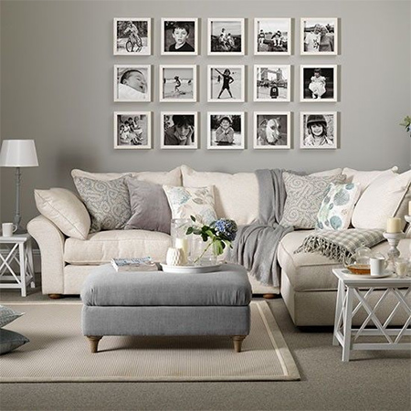
Shades of grey bring out the best in a room with architectural detailing. Just a few pops of discrete colour complement the otherwise monochromatic setting and create an overall impression that is feminine without overpowering the room. Using a single colour on both walls and accessories is very popular in contemporary setting where you want to create a very strong, clean look. This look can make a room feel extremely calm and visual larger, as there are no contrasts to draw the eye.
Shades of grey that are selected from the red side of the colour wheel are warm and sophisticated. You can use grey with any colour combination or keep it simple with a single colour.
Choose your shade of grey the side of the colour wheel that best suits the room or space that you are decorating. Shades of grey with a hint of blue are cool and just the thing for a hot room, while grey with a hint of red or yellow is warm. Light shades of grey - those with only a hint of colour tint - are perfect for projects with a distressed finish. My favourite colour for furniture painting projects is Plascon Pieces of Eight with just a hint of yellow for an ivory finish.
The traditional approach to decorating is to use a colour on the walls and gloss enamel on panelling and woodwork, quite often the same white as that on the ceiling. While this offers a clean look, it can sometime feel hard. To soften the contrast, select a satin or velvet white to make the contrast more gradual.
It's so easy to decorate any room in shades of grey as the background for adding colour and layered texture. When choosing grey it is important to select a shade that complements the colours used in the room. Visit your local paint centre and take home colour swatches to view under different lighting conditions.
It is important to view colour swatches both in natural and artificial light conditions, as colours reflect light in different was. If you have the opportunity to purchase small tester pots of paint - do so. This will make your colour choices easier. If you have a Plascon Showroom or paint centre close to you, it is well worth a visit if you are finding it difficult to make a decision.
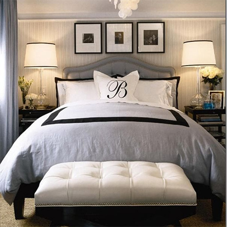
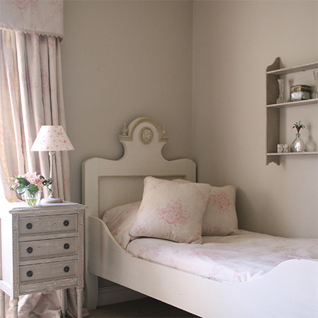
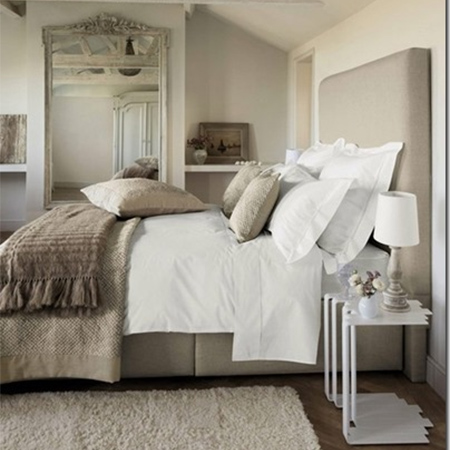
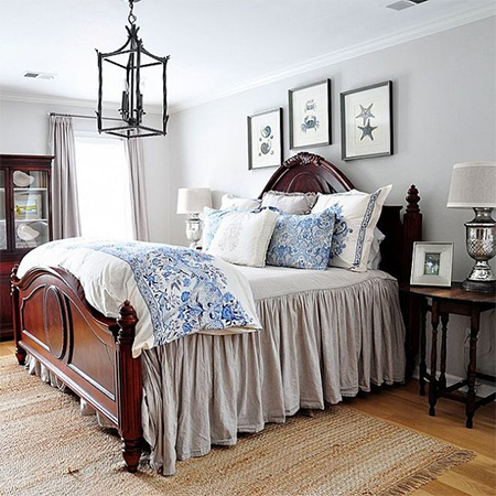
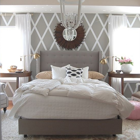
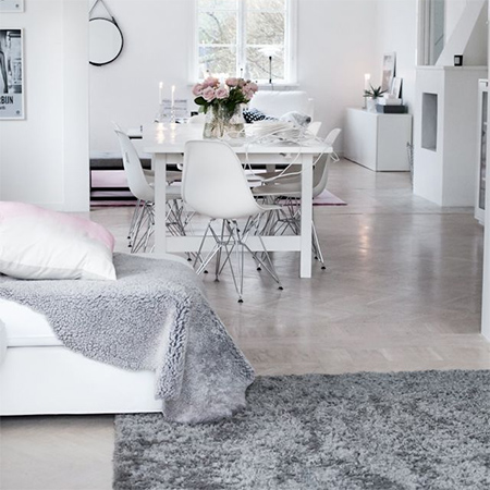
Shades of grey are wonderful for decorating a bedroom if you are looking to create a room that is calm and soothing. Whether you decide to paint walls and trim or layer the bed, grey is one of the most versatile colours to use.
Use light colours on walls if you are using dark wood furniture. The light walls provide the perfect backdrop for dark furniture and prevent a room feeling confined and stuffy.
settingforfour.com
housetohome
The use of a dark colour on skirting boards not only makes the walls appear lighter in contrast, it also creates a strong contemporary look making everything above it feel lighter in contrast, and therefore the overall feel of the room is lighter too.
housetohome
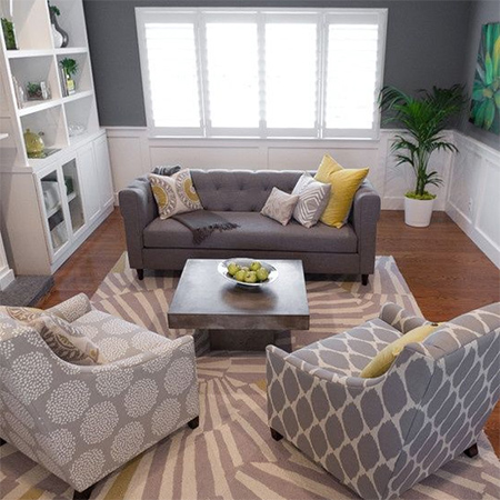
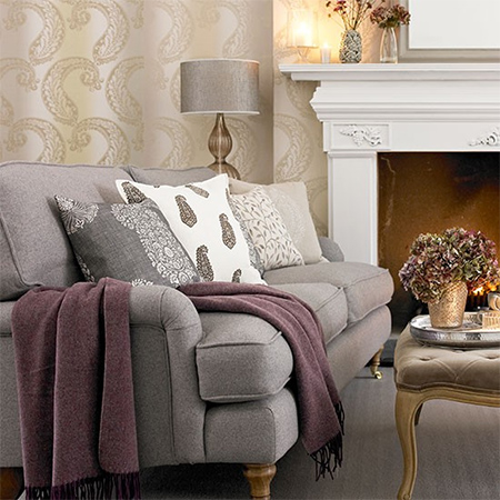
It's so easy to punch up the colour in a grey room using accessories, whether bought or made. Use decor accessories to introduce colour into a grey scheme, or take colours already in the room and up the colour level with matching accessories.
And take into consideration that ceilings don’t have to be white! The height of a ceiling is determined - not just by the colour - but by the contrast between the wall colour and the ceiling colour. Where you add grey to a wall and paint the ceiling a bright white, the eye will be drawn to the strong contrast between the two colours and you become more aware of where the walls end and the ceiling begins and visually fools the eye into thinking that the ceiling is lower. Reverse this effect with a ceiling colour that is just a hue darker and the ceiling feels higher.